See the page on the stage at the width of a phone, a tablet, a laptop, or a desktop, the way a user on that device sees it. Do this before you ask for a change that only matters at one size.
Before you start
Build Mode open on the page, see Open Build Mode and move around your app.
Steps
Click the screen icon at the right end of the toolbar above the stage. The menu lists Full width and five sizes: Mobile 390 × 844, Tablet 768 × 1024, Laptop 1280 × 800, Desktop 1440 × 900, and Large desktop 1920 × 1080.
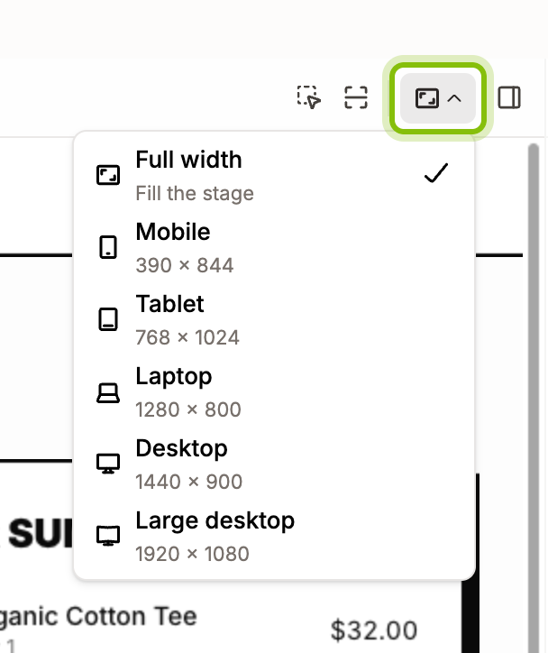
Pick a size. The page reflows to that width in the middle of the stage, and the icon on the button changes to the device. A width wider than your window is scaled down to fit.
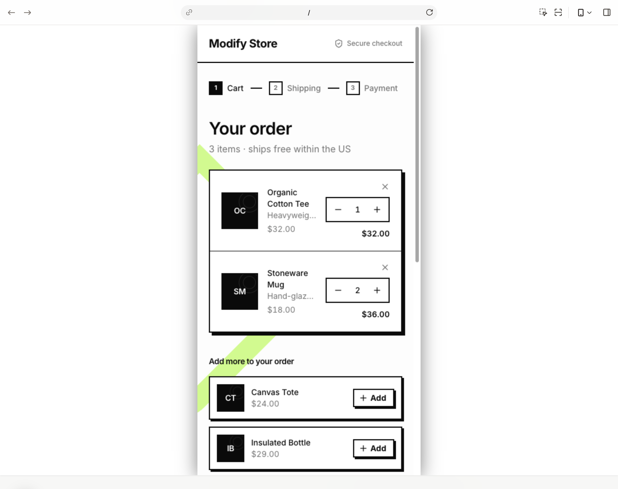
Pick Full width to let the page fill the stage again.
The Portal on the canvas takes the size you picked, so it shows the same width when you go Back to Canvas. Full width sets it to Desktop.
Several screen sizes at once
Build Mode shows one width at a time. There is no side-by-side view of a phone and a desktop inside it.
To design for several screens, put one Portal per size on the canvas and set each one's Preview Resolution in the design panel, see Add a Portal to the canvas. Open Build Mode from the Portal whose size you want to work at.
If it does not work
The menu starts with Custom, greyed out: the Portal was resized by hand on the canvas, and Build Mode kept that width. Pick a size to leave it.
Text looks small at Large desktop: the page is 1920 px wide to your app and scaled down to fit your window. Zoom your browser or pick a narrower size.